
brand | graphic design | eventWhat happens when a business owner loves their logo, but also knows it needs a refresh to better connect with the people they’re trying to reach?
Enter Hot Tubs of Northern Minnesota and their iconic rubber duck.
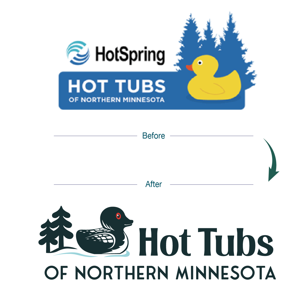
The owner had featured the duck in the logo for years (and loved it), but he also recognized the value of an update. Plus, they were shifting their name from “HotSpring Hot Tubs of Northern Minnesota” to simply “Hot Tubs of Northern Minnesota,” which made it the perfect moment to revamp the brand mark.
And if years of visiting small-town bars in northern Wisconsin with my family taught me anything, it’s this: people love a fancy rubber duck. Rubber ducks aren’t going out of style anytime soon, but the classic bright yellow “bathtub duck” doesn’t exactly scream hot tubs. (Jeep owners get it. They know a cool duck when they see one.) Add in the duck claw machines in small-town bars and arcades, and well, my kids have amassed an impressive collection at home.

So the challenge was clear: create a fresh, modern logo while keeping the duck that customers already recognized.
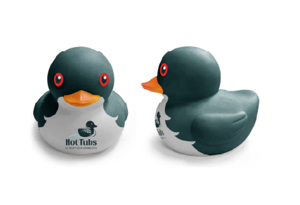
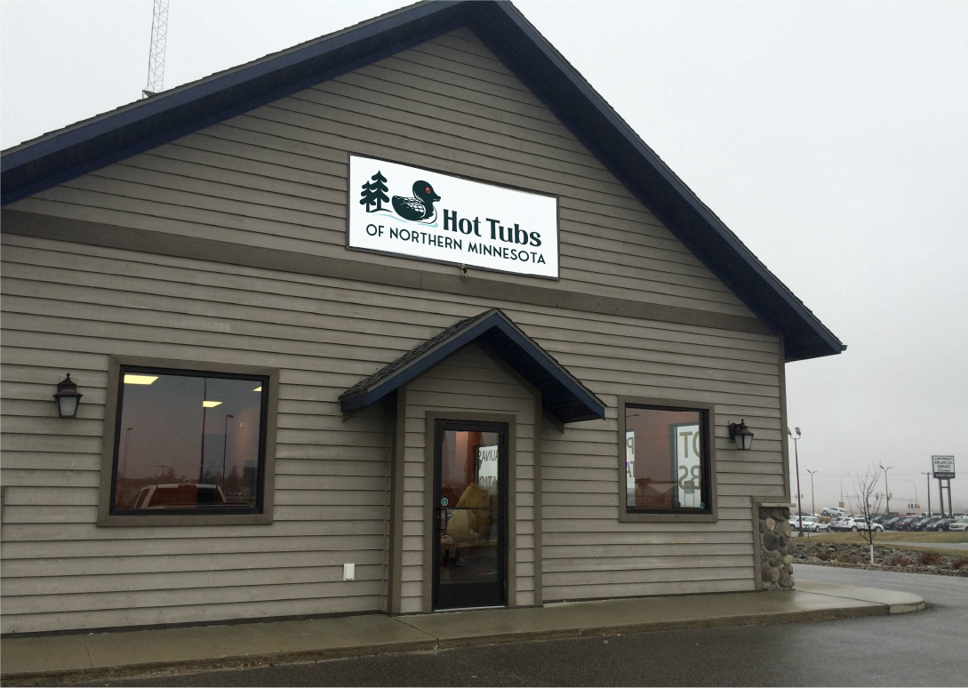
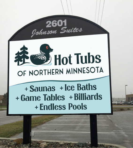
The solution? We upgraded him to represent the region Hot Tubs of Northern Minnesota calls home by transforming the duck into a loon.
To keep the essence (and familiarity) of the original, I maintained the same general shape of the classic rubber duck, but redesigned the details to read unmistakably “loon.” The result feels aligned with their audience and location, without being a jarring departure from the brand people already knew.
And as a bonus?
Enter the coolest swag item now possible: custom rubber ducks.