brand strategy & expansionAbout Lucidity Sciences
Lucidity Sciences is a deep tech AI company with a big mission: bringing cutting-edge research to the people and partners who need it, in a way that actually feels accessible.
The Challenge
Lucidity Sciences was looking for an upgraded visual identity that matched the groundbreaking work they were producing. They needed a brand that could communicate where they are headed, along with the trust and expertise they bring to every relationship they build. They wanted to keep their logo, but upgrade and expand everything in the brand ecosystem around that logo.
Why do this work now?
The team at Lucidity Sciences realized that the brand that got them where they were wouldn’t be able to get them where they wanted to be. They were at a point where they needed structure, systems, and clarity to grow. They were feeling the holes in the system and were ready invest in their own image.

The Work
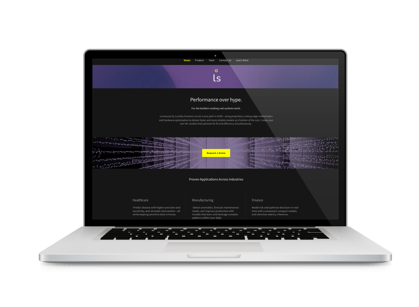
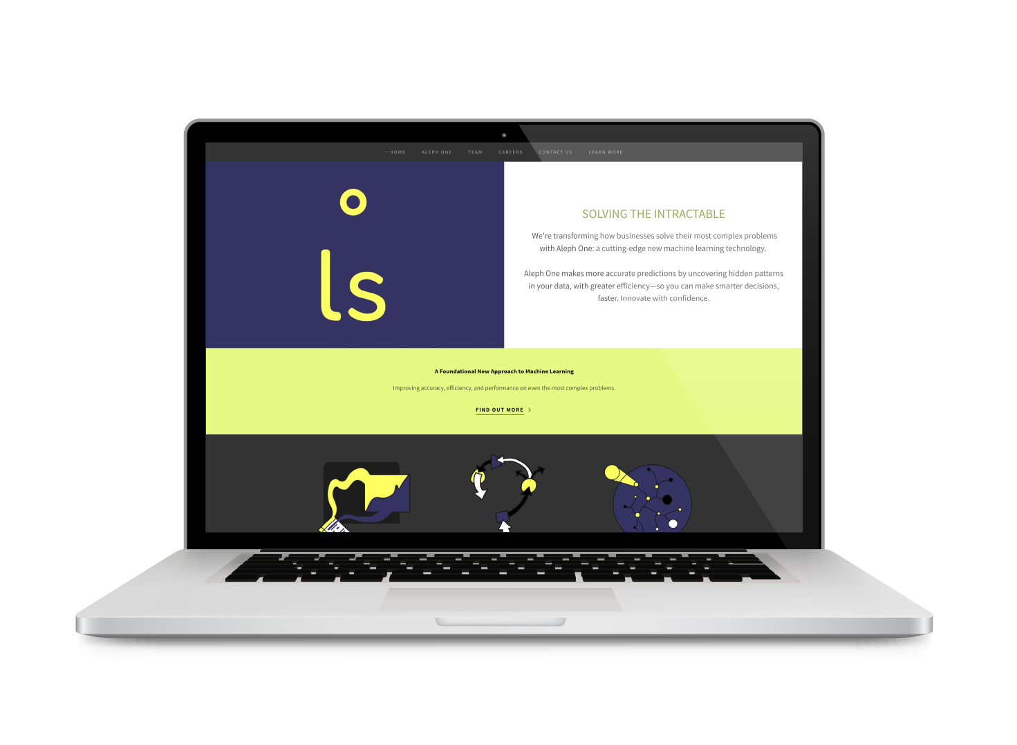
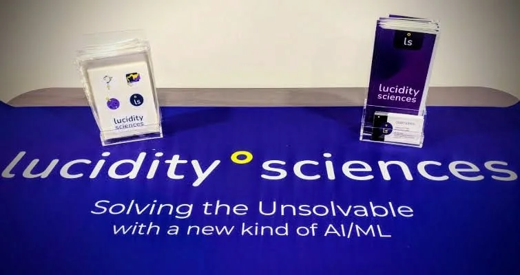
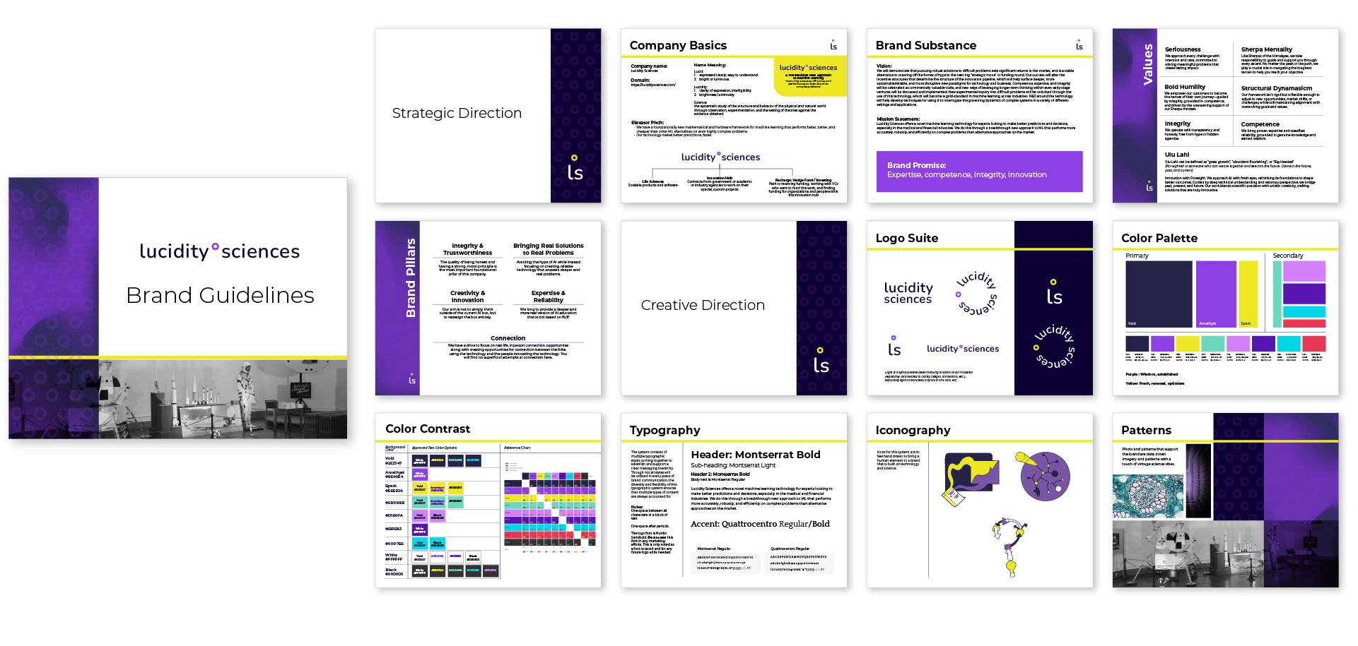
Before anything was designed, I sat down with the Lucidity team to really understand their strategy, their culture, and the space they were operating in. From there, I built out a visual brand and product naming structure that actually reflected who they are. They didn’t need a whole new start, just a honed-in and purposefully built system from where they were. This included an expanded logo suite, updated colors (bolder versions of what they had), defined illustrative style, patterns, directions for photo use, and product naming.
Along with the visual work, the strategy meetings and workshops led to a clearer definition of their brand pillars, values, and an understanding of how their brand, products, and future sub-brands work together and support each other. This all came together in a full brand guide.
The Outcome
Lucidity Sciences walked away with a refreshed brand and a library of assets they and their partners are genuinely proud of, one that has made their presence and communications more effective since day one.
"As a deep tech company innovating on the frontier of AI, our mission was to help bring the full capability of cutting-edge research to our users and partners in the market in an accessible and empowering way. We wanted our brand to communicate both that orientation towards the future of technology, as well as the trustworthiness, approachability, and respect that we were committed to building our relationships on.
Because of the technical nature of our work, creating a visual brand with the power to instantly communicate our values and mission was an essential element. Emily spent time with the team, making sure she understood the strategy, the landscape, and our culture, and synthesized those learnings into a visual brand that has helped to transform the effectiveness and salience of our communications and presence within the market and ecosystem.
It's a brand that we and our partners are proud to be associated with, and Sondery Studio helped us lay a lasting foundation for that brand that has payed dividends in the time since.”
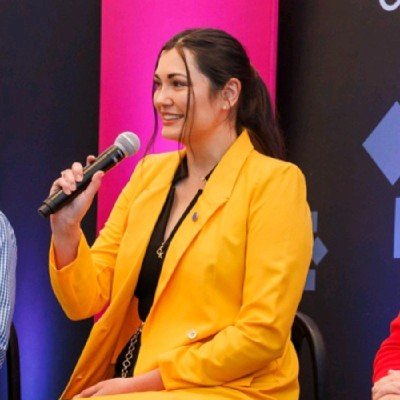
Alexandra Pasi
CEO & Co-Founder, Lucidity Sciences
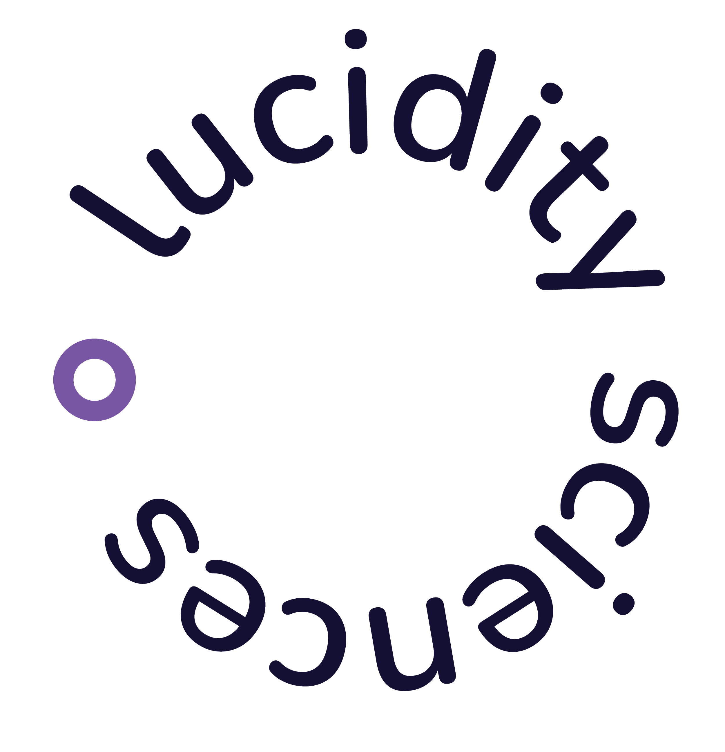
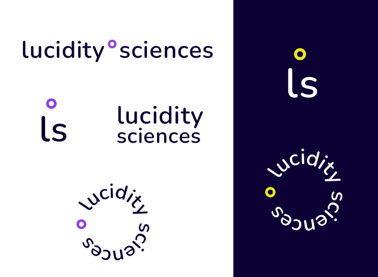
Expanded the logo set into a full set that is more supportive of the growing brand.

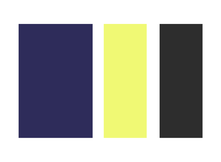
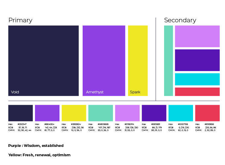
From a limited, subdued palette to a bold, fully built color palette with primary and secondary colors, along with color contrast details.
The Lucidity Sciences team took the new brand and applied it to their range of marketing collateral, including launching a new website.