What’s in a Destination’s Logo Suite?
Your logo is often the first impression of your organization — but there's more to it than just one image.
Most people believe “brand” equals “logo” when in reality, your brand is so much bigger than that. With that said, your logo is often the first impression that somebody has of your organization. Because of this, we need to ensure that your logo suite supports your marketing and organization goals. Also, do you have a destination-only logo? Hmm…
But why isn’t one logo layout enough?
A single logo format doesn’t cut it for supporting your brand across all its channels. You cannot fit a rectangular peg into a round hole, so why would you try to fit your long, boxy logo into a round profile photo? Having a flexible logo is wildly helpful for your creative team, too.
As a designer, being restricted on our logo options can be limiting for our creativity. Your logo suite should be an asset to your organization, and its communication with it’s target audiences. Simple variations on the same logo can work the best to ensure it’s recognizable as the same entity, no matter the version you use.
Take Stock of What You Have
Start with having a solid understanding of the logos you currently have available for your organization. Gather all existing logo files in original formats and organize them in your folder structure of choice.
Remember to always use and share the original files. We’ll discuss file types in a different article.
Avoid:
Screenshots
Low-resolution files
Copies of copies (which can distort color and quality over time)
Common logo variations every organization should consider:
Primary logo
Secondary logo
Horizontal (long) version (could be primary or secondary)
Stacked (vertical) version (could be primary or secondary)
Icon or symbol
Badge or seal
Social media avatar version
Favicon
Mascots (if applicable)
Monochrome (one-color) version
Now, do you have these versions of your logo for your organization AND as a “destination-only” version?
Wait, wait, wait… what’s a “Destination-Only Logo”?!
Simply put, it’s a version of your logo that only has your destination name, not your full organization name.
The most important thing that I want you to take from this entire article is whether you can answer this question... Do you have variations of your logo for both your organization and your destination? You might be wondering, “Why the heck do I need my organization logo and destination logo?!”
In my time working with various DMOs, I’ve found this to be a valuable asset for destinations. These are meant to serve different purposes and audiences, and all support your brand.
Here is an example of a logo set that has both organization and destination logos. You can see that they are wildly similar, but different.
Know Your Target Audiences
DMOs have a variety of different general target audiences that I will cover here for examples. First and biggest being Leisure Travelers.
1. Target Audience: Leisure Travelers
Best logo to use: Destination Logo
Goal with this audience (these are very vague goals for the purpose of applying this to many destinations):
Get people to visit.
Educate the public about things to do and where to stay in your community.
Stay in hotels.
Spend money at local businesses.
Share their experience.
Why? It’s not our job to educate travelers what a CVB/DMO is when they are looking to be inspired to travel to our destination. In that moment, it’s our job to make our destination desirable and welcoming.
Travelers search for places, not organizations.
Example: “Hotels in New York City,” not “NYC tourism bureau.”
The DMO’s role is to sell the destination experience which places the destination first.
Destination-first branding feels:
More authentic
Less bureaucratic
More emotionally appealing
2. Target Audience: Stakeholders (board members, city officials, business partners, industry peers)
Best logo to use: Organization Logo
Goal with this audience (these are very vague goals for the purpose of applying this to many destinations):
Build trust in the organization.
Clarity of mission.
Professional credibility.
Educate on the importance of tourism in destinations.
Continue to defend the budget and mission of the organization.
Why? This target audience is working directly with staff and supporting the role of the tourism bureau within the destination. It’s important for them to know the organization and understand them fully in order to support the mission. This is where your organization's brand shines through.
3. Target Audience: Meeting and Convention Planners
Best logo to use: Organization Logo when selling to the planners, Destination Logo when speaking to attendees of planned conferences
Goal with this audience:
Book meetings and conventions in the conference center, hotel, or various meeting spaces available in your destination
Why? This is more of a B2B transaction, where meeting planners work directly with your staff and partner staff to plan and book conferences or meetings.
While working directly with the meeting planner or marketing, the organization's logo is important for building trust and credibility. This audience knows what a DMO or CVB does for them and this logo resonates with them.
After booking: Provide planners with the destination logo to promote to attendees. Attendees fall more into the Leisure Travel audience and care about the city, not the tourism office behind it.
Recap:
Stakeholders: use your organization logo to build trust and recognition
Meeting planners: start with the organization logo, then transition to the destination logo when supporting attendees
Leisure travelers: lead with the destination brand — that's what they're searching for
Do you have a different target audience? Ask yourself what your goal is with that audience and what logo would resonate with those folks.
Real-World Applications
Beyond target audiences, what are some real-world applications for your logo?
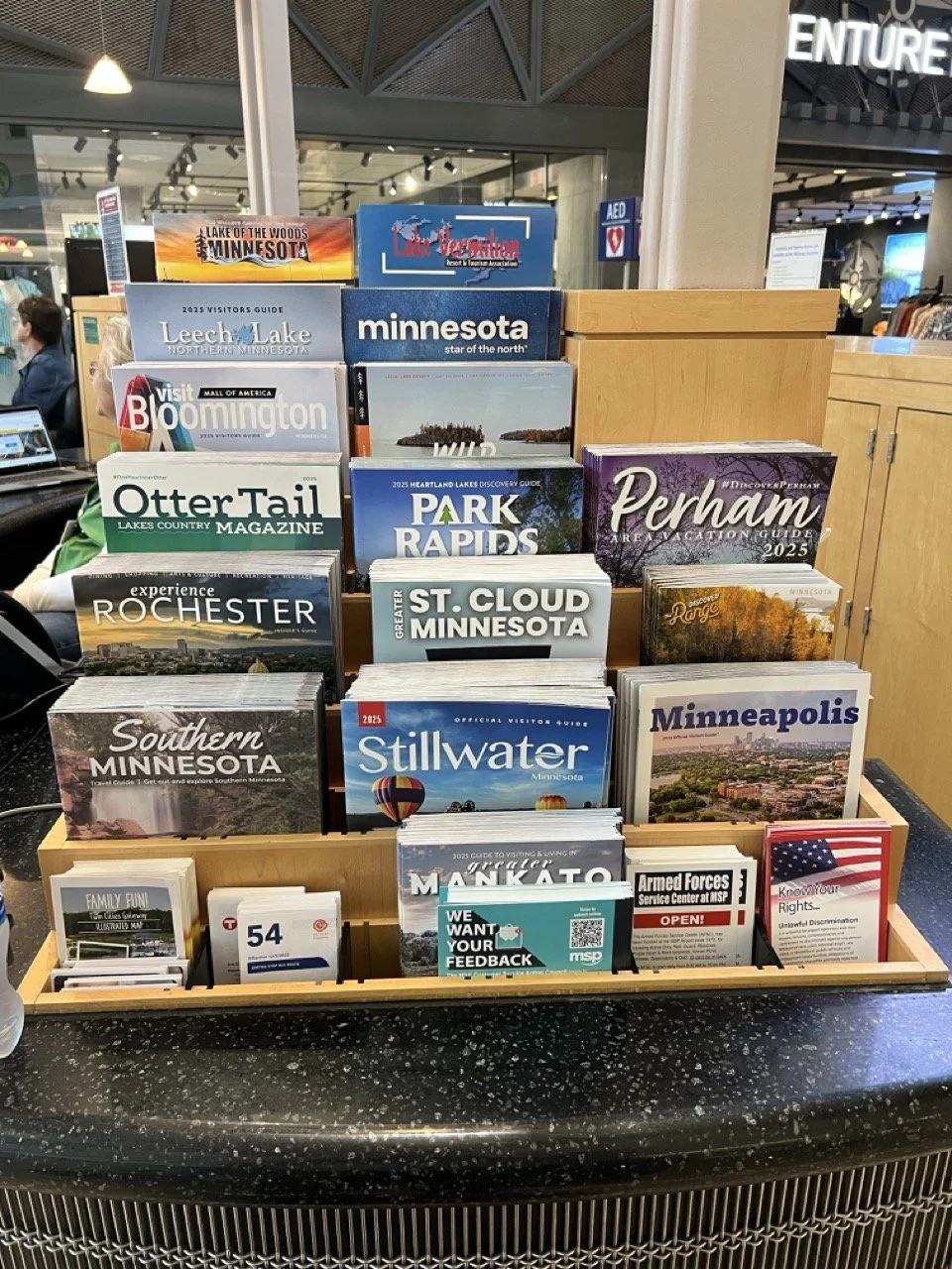
Visitor guide: Let’s look at how so many destinations already use a destination-first approach on their guides. Look at any airport or rest stop brochure rack: the destination name grabs attention faster
Website: I would argue that the logo that visitors need to see right when they land on your website is your destination logo. Just like a visitor guide, you're grabbing attention and ensuring travelers know you're promoting the destination, not an organization. The footer and contact page should be where your organization logo shines! It’s meant to feel like “This Destination!” Presented by “Our Organization!”
Merch and swag: Quick reality check… does a leisure traveler truly want your organization logo on their shirt, or do they want to show off the destination they just went to (in turn, becoming a walking billboard for you). Merchandise and swag should feature the destination, not the organization.
The goal of leisure or local swag with the destination logo:
Create community or travel pride
Generate word-of-mouth marketing
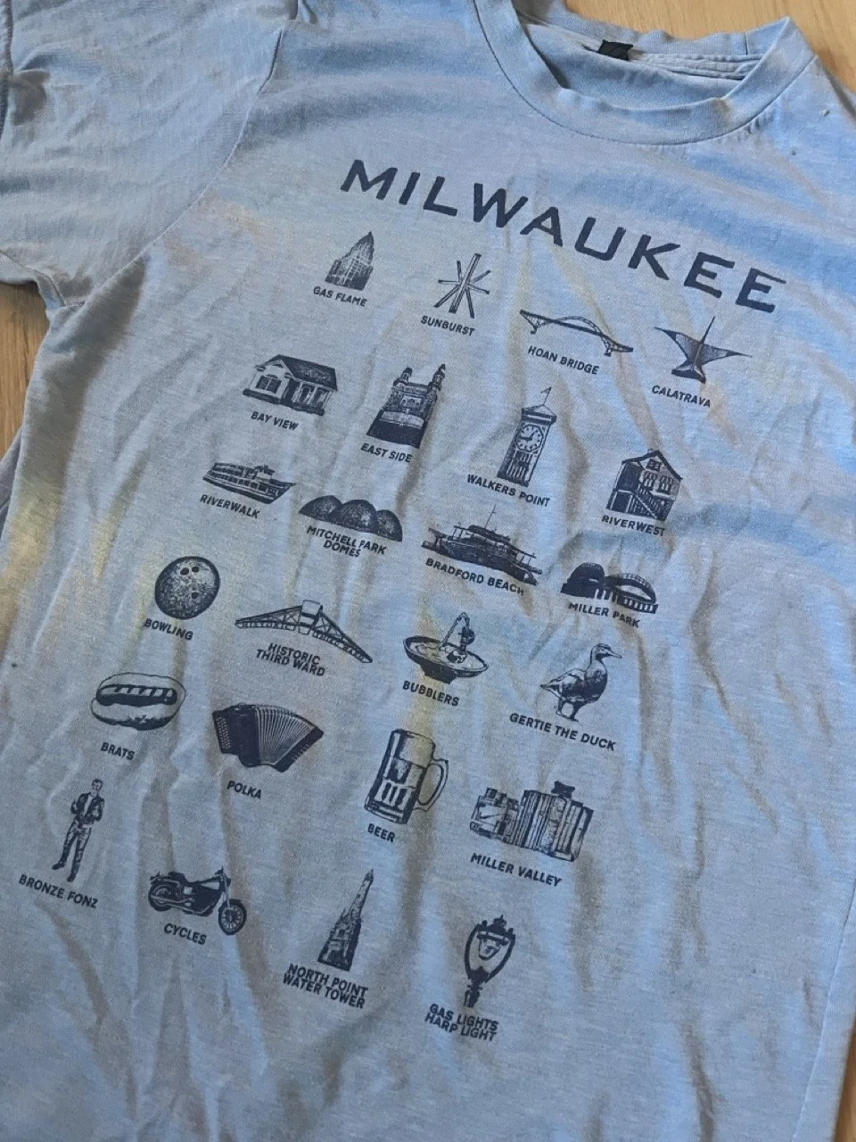
Example: Milwaukee shirts. I wear this Milwaukee shirt all the time (and I’ve had it for years) still because I love the city of Milwaukee and it’s a good quality shirt. I would have tossed it if it was just a Visit Milwaukee shirt because that is a completely different vibe.
The goal of group sales or partner swag with the organization logo should:
Provide organization name recognition
Spark pride in the tourism business community
Example: Deneen mug for local partner appreciation at VSP
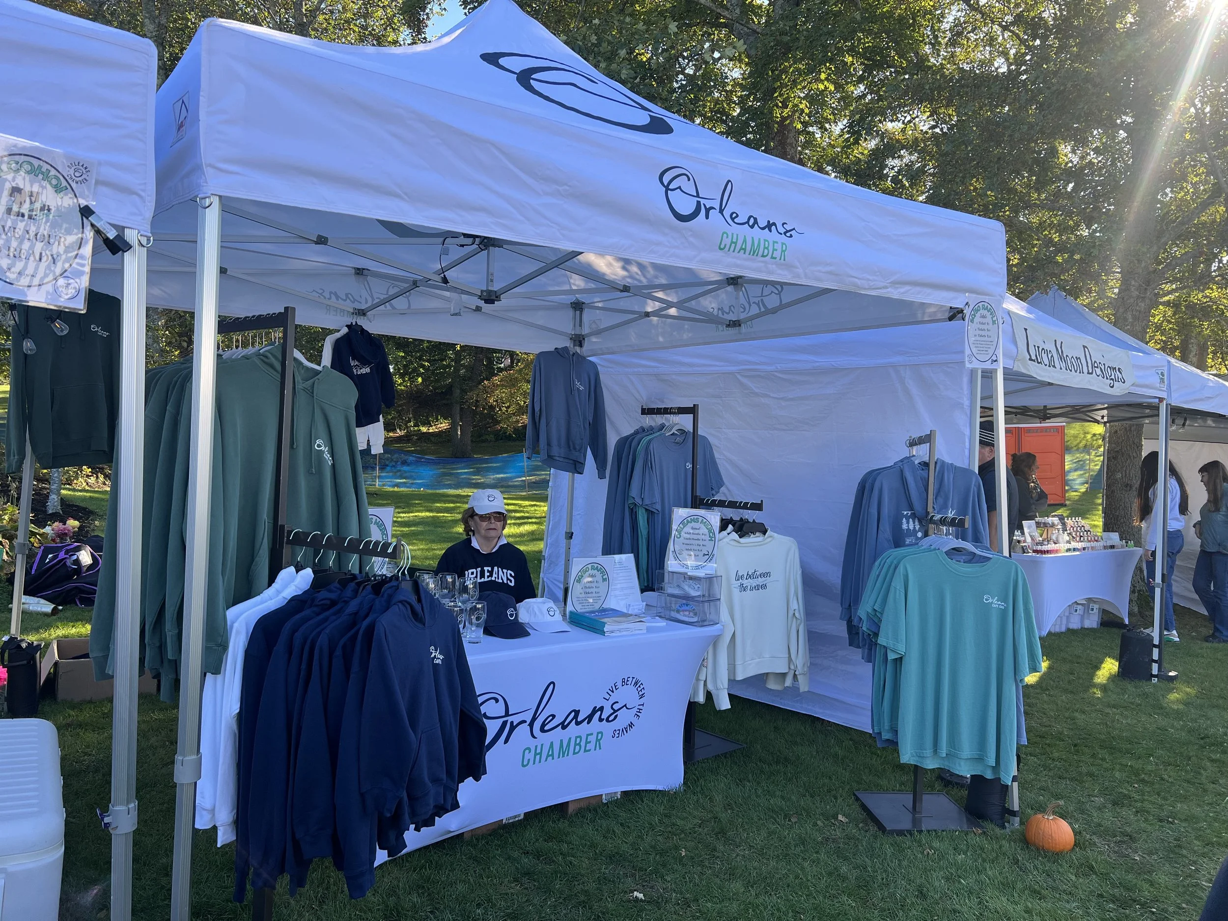
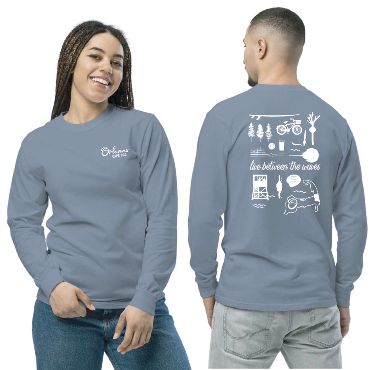
Orleans Chamber of Commerce understands this. They have an array of logo options, but their merch promotes their destination on high-quality, trendy pieces of clothing. When the goal is building community pride, highlight the destination!

Destination and Chamber Examples:
Visit Corpus Christi
I must highlight Visit Corpus Christi as their brand is golden. And no, this is not my client, and I’ve never met anyone on their team, but I found their brand through a LinkedIn post a while back and dove into their brand a bit from there. They use their destination logo in their header and their organization logo in the footer, and this landing page feels very authentic and successful. Their “meetings” page with that meeting planner target audience has “Meet Corpus Christi” as the logo (which is a step further down this road of having a flexible logo that supports all your sub-brands). Also, they have a Chief Brand and Innovation Officer. What a dream!
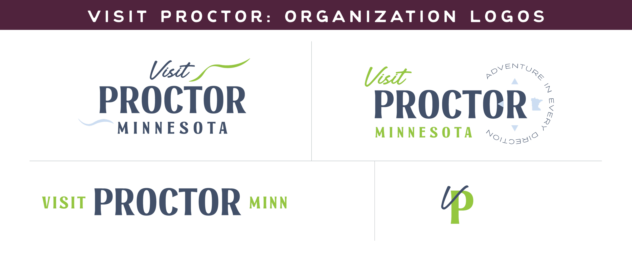
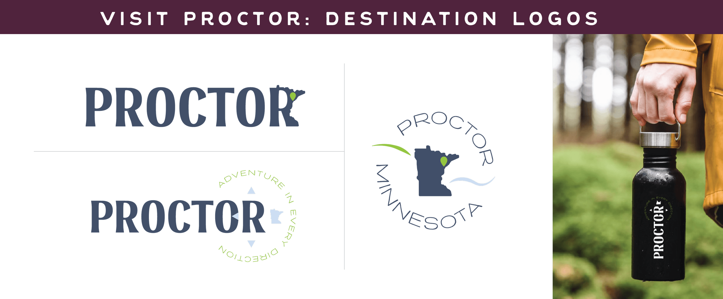
Visit Proctor
Pictured above, I designed Visit Proctor to have a flexible logo that could support the organization and destination variations.
Now, what about the dual organizations that are Chambers and Tourism Organizations?
New Ulm Chamber of Commerce
Those have a unique opportunity rally around your destination logo and be the brand overlap your community might need to create community pride. Let’s look at New Ulm, Minnesota, for some inspo on this! (Full transparency, New Ulm is NOT a client of mine, just an inspirational brand!)
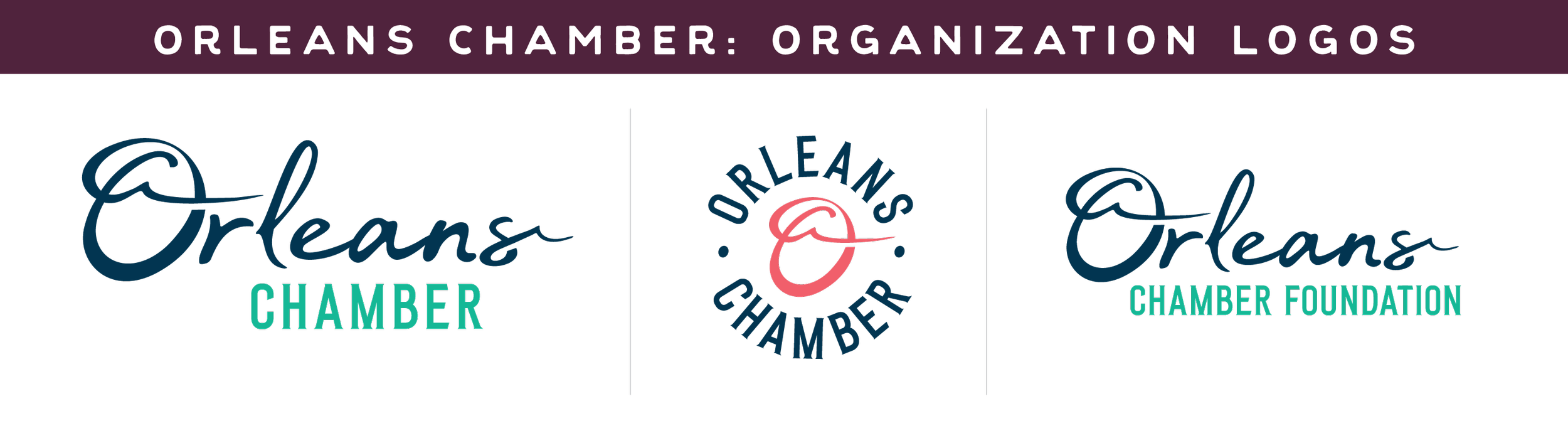
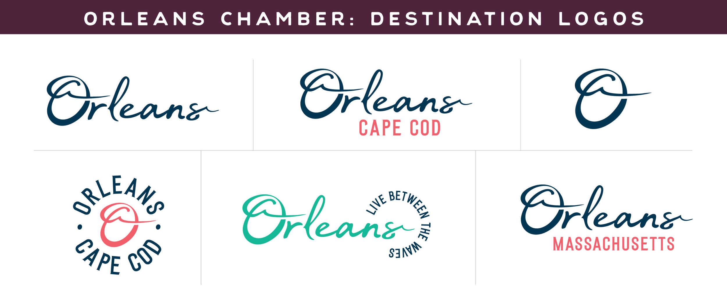
Orleans Chamber of Commerce
An example of a brand that I designed and applied this to is the Orleans Chamber of Commerce. While they are more chamber than tourism organization, one of their main goals is creating community pride. They use their various logos to support their efforts, whether it’s getting new business partners or selling merch as a revenue driver.
In conclusion…
Do you have:
Multiple logo variations?
A destination logo?
An organization logo?
Clear rules for each?
If not, that is one of the biggest brand clarity opportunities for your DMO.
Hi. I’m Emily.
I write about this stuff because I work in it every day and truly love it. If you're a tourism brand or small business that wants a creative thought partner on these types of topics to brainstorm where your brand could grow, I'd love to connect. No agenda — just a good conversation.
→ Find a time that works for a free creative discovery call!
Read more of my blogs below: